Posted: 11 years ago
Color Matching with Architectural Decorative Glass
Color, in its most basic sense, is the perception of different wavelengths of light within a visible spectrum. The human eye can perceive anything ranging from about 390 to 700 nanometers, which represents all colors of the rainbow. Wavelengths that lie outside of the range, such as UV rays and radio waves are not perceptible and therefore not visible to the human eye.
Last week, Goldray explored a few of the considerations that designers and architects make when choosing colors for a space. This week, we are going to share some of the processes and challenges that arise when manufacturing a glass product once a color has been specified for use in a design.
When Goldray is asked to create a glass product in a custom color, the process is a delicate balance of manual, “recipe” like mixing with highly scientific measurement of the color produced. Our color experts who work in the Goldray laboratory are trained to manually create a match based on a color chip that has been supplied by the customer. The lab experts must take into account what type of glass the paint or ceramic frit is being applied to, as well as the processes occurring after the paint is applied, which may alter the final color. Next, the medium is created and applied to the glass. At this point, the lab technicians can use what is called a spectrophotometer to measure the color they have created. This tool reads color by measuring the wavelengths in the visual color spectrum to give an absolute, objective reading of the color that is being viewed. Once applied to glass, this color can change again, due to factory processes, so our quality control team has another spectrophotometer in the factory that is used to ensure the color originally specified by the designer, is what is being viewed on the final product. There is, of course, always a small level of variance allowed for in the color based on variances found in glass and pigment color. This is a mutual understanding for people familiar with working with glass, but is always something that should be talked about when customers are new to using this medium.
“One of the many challenges we face when offering color matches is the wide array of colors that are all different variations of white,” explains Matt Christie, the Western Canada Goldray Sales Rep. “Really, white is not a color as much as it is a very unsaturated version of a color. Whites can have hints of brown, yellow or any combination of different colors. Achieving the perfect tint takes time and experience”.
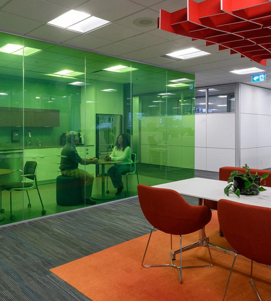
Goldray has a broad range of standard colors available for both backpainted glass and glass printed with a ceramic frit pattern. If those colors do not fit into your design, we are always happy to do a custom color match to ensure that the decorative glass you receive from Goldray fits perfectly with your design intent.

