Posted: 8 years ago
How Color of the Year is Chosen
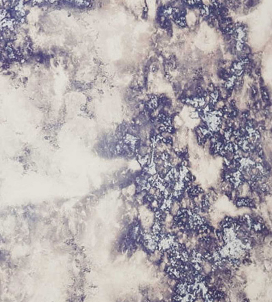
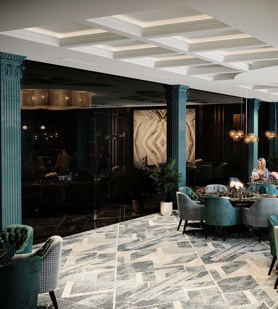
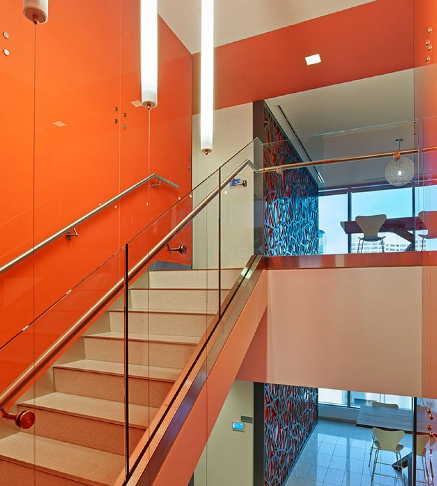
As most people know, color is essential when designing the interior or exterior of a building. If the wrong color combination is picked everything can look disjointed. But when the right colors are chosen, harmony in a space is created. As the year winds down, color trend predications are common. This year Sherwin Williams debuted Oceanside, a green-blue jewel tone, while Benjamin Moore chose Caliente, a vibrant, powerful red. Just last week, the Pantone Color Institute, released their color of the year, Ultra Violet, a complex and energizing purple. Each establishment releases their own color and matching color palette, but no two predictions are the same. It begs the question, how do these organizations come up with their color predictions?
Pantone has been announcing color of the year since 2000 and is considered to be the world’s leading color authority as far as trends are concerned. They chose a celestial purple because of it’s symbolization of non-conformity, experimentation and association with mindful practices. Color of the year “has come to mean so much more than ‘what’s trending’ in the world of design; it’s truly a reflection of what’s needed in our world today” says Laurie Pressman, the vice president of Pantone. Pantone will look at everything from the colors of cars being produced to trends in the fashion industry.
Psychology is a very important factor; colors are usually associated with global stereotypes or environmental associations, but also vary from person-to-person based upon personal and cultural upbringings. Behaviours can be influenced with certain color hues and tones, a field of study called Chromodynamics. For example, casinos use red because it is shown to raise blood pressure and increase gambling tendencies, while hospitals use light blue to encourage calmness. Last year, Pantone picked “Greenery” as their color of the year. It was a vivid green which was chosen to provide the reassurance that people yearned for during a difficult social and political time period.
However, political factors and current events are just one aspect to consider. Benjamin Moore states that they spend months traveling around the world researching influences from different industries and cultures before bringing all the information together to find a common global movement. This year, the color Oceanside was chosen for its refreshing tone that encourages meditation and creative thinking.
While Benjamin Moore dispatches their own team to do research, Sherwin-Williams consults with professional color associations like the Color Marketing Group (CMG) and Worth Global Style Network (WGSN). CMG is an international non-profit association that have color design professionals (such as Pantone) gather at ChromaZone workshops around the world with their proposed color choices to provide regional forecasts for their International World Color Summit in late fall each year. Participants bring Powerpoints, color swatches and influences to present with their color recommendation. Often their influences are a result of talking to historians, architects and fashion experts and watching trends with food, travel, sports and politics.
Forecasting a single color out of over ten million options to represent an entire year is challenging when there are many factors to consider. To stay in the know about the latest industry trends, subscribe to our email newsletter, or join us on Instagram, Facebook, LinkedIn or Twitter where we regularly post project pictures and case studies as we build our community of industry professionals.


